Tuesday, November 29, 2011

1 comments:


john coppola said...
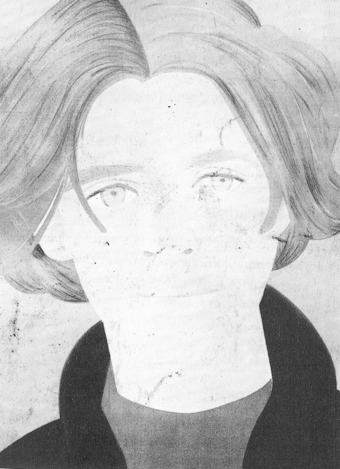
In this drawing that Elizabeth (My sister) did. I would say it fits in with the realism and the objective categories. Why I chose this picture is because for one I was there when she drew it. In minutes she put a very lifelike looking drawing of my daughter to paper. I wouldn't say that it is photo-realism like the image of the shoe on page 16 part one of our text. But I would ideally like to look at someone across the table from me and draw a life like resemblance of them.
That was what I picked and said at the beginning of the semester.
Now the picture that I picked from the reading of the text. 
This is image 10.12 by Alex Katz, it says it is his Homage to Frank O'Hara this is found on page 231 of the text in chapter 10.  
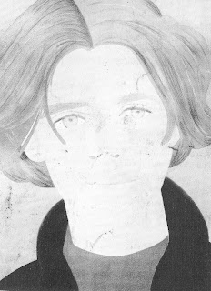
I chose this photo for a couple of reasons.  One it seems the most like one I would like to attempt to draw.  Two I really like the simplicity.  There is value based on the different colors like the jacket and shirt as well as the hair. This is not like value that the rabbit on page 93 has, the rabbit  looks simple and yet seems very complicated at the same time.  This is more like when we created a grey scale for our shapes and used different shades for an entire surface of an object to create depth.  Some things I like just like when I started.  This represents figure or body art.  That is what I am interested in drawing.  Weather I am drawing real people or comic book characters I mostly like the close ups of the face so Body Art is my Ideal drawing.  Though I would consider a good landscape.  In this particular drawing I am impressed with the implied chin.  Chins are not always easy to draw and the fact that there is no actual line but an implied one and you still feel like this is a person you could meet is pretty neat.   It almost looks like this is a collage of cut outs when you look at the coat and hair but I believe it is a drawing. 

Sunday, November 20, 2011

Perspective drawings

This is an Ant's Eye View like the next one.  This one was drawn with Charcoal and I thought it came out a little better than the next one.  I tried to give more detail to the lower right which was closest to me in the drawing.  I had more difficulty with the ants eye than the rest I felt.  
This is my least favorite of all of my attempts.  This is the only one I did in pencil.  It is an attempt at an Ant's eye view.  I set the objects on the edge of a table and drew them looking up from the floor.

Birds Eye View,  I tried to focus mostly on the cone and therefore,
I made it larger then items that were larger than it.  I also tried to give the cone more detail.
This is different than any layout I have done.  I was able to space the objects out more like a city.   Usually I have them all tight together.


Three Vanishing points drawing.  I tried to make the ball and cone fade out like the to sides.
It was a little more difficult to pull off.
Here is my two vanishing points attempt.  I tried to draw the cylinder and ball true to size -
and fade the rest to vanishing points.  


One vanishing point.

Paper Bag

This is a paper bag drawn with a black Conte' Crayon.  
This was a paper bag drawn with Charcoal.  The corners were twisted a little for extra character.


Tuesday, November 15, 2011

http://chuckmanchicagonostalgia.wordpress.com/2009/09/30/palmer-house-hotel-corner-view-1912/

 Here is an example of a two vanishing view point picture.  If the horizon line is at the bottom you can see how if you go down either street the farther away from the center you get the smaller in size until you reach a vanishing point.


 Drawing by Henry Farrer.

http://chestofbooks.com/crafts/general/Arts-And-Crafts-Magazine/Pen-Drawing-For-Illustration.html

I think this is a good example of the Aerial perspective because of all the detail in the up close part of the picture.  As you get behind the row of trees things start to get a little blurry which is a characteristic of  Aerial drawings. The objects in the foreground are larger and as you get in the distant back ground there are smaller little trees. 

Sunday, November 13, 2011

Color

Here is a picture using a primary color scheme.  I added the orange ball to add more flavor.  The block, cone, and cube follow the primary color scheme.  Again the ball is more of a complementary color as it is directly across from the blue on the wheel. I also added the black and white background for a little more variety and to add a semblance of dimention. 

Sunday, November 6, 2011

Texture

Collage of still life with texture
Drawing of Still life shapes
Ink print Potato with circle cut
Ink print Potato with cone cut out. 


Ink print toy scorpion  
Rubbing of pan with 2B Pencil

Puzzle with Conte Crayon

Side of kids treasure chest with Compressed Charcoal